


15 Best Practices for Website Navigation Design in 2022
Brad Sawayn
Introduction to website navigation design best practices
The advancements in internet technology changed everything for businesses in 2022, for some industries changed dramatically and became a true paradigm shift. The correlation between a great website or mobile app for most organizations is higher than ever before.
We live in a competitive business environment right now. No matter what industry your business represents, the chances are very high that you will find competitors with high-quality content and representation on the web.
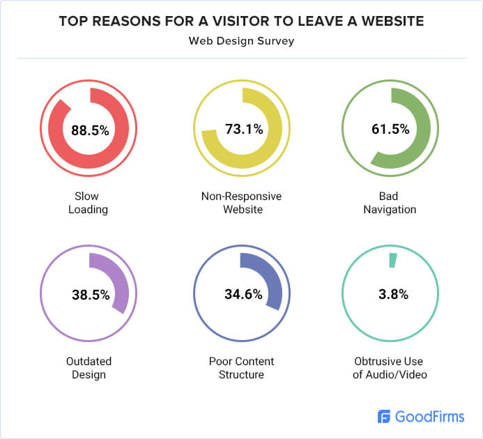
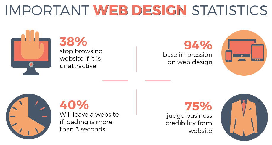
How to stand out among 1,139,467,659 available websites, according to Siteefy? Well, it will be tough, and it requires a combined effort from the design, marketing, content, performance, and user experience standpoint. While 94% of first impressions are closely related to the design of your pages if Web FX is to be believed, nearly 90% of customers switch to a company’s competitor after a bad user experience. Here are some more detailed reasons for users leaving websites by GoodFirms research:
There are a lot of areas to cover here, but in this article, we will focus on one of the key elements, which is called website navigation. Simply put, navigation is a way to find information on your pages.
Key types of navigation
- include meta (top-level)
- primary (under top-level website navigation bar)
- secondary and tertiary (can be a horizontal listing or a sidebar)
- footer (the bottom of the page).
The most popular types of website navigation elements
- Breadcrumb menu
- Hamburger menu
- Tabs
- Vertical navigation
- Call-to-action (CTA) buttons
This time we will not dive into technical details or draw a diagram for web navigation, but rather offer you some important tips that will help you along the way. If you are building from scratch, or in a website redesign process, you may find this website navigation design guide helpful, because it is based on real-world experience and expertise.
Website navigation best practices: Top 15 pro-tips
Here is a list of things you should keep in mind while developing your website navigation structures. Hopefully, they will help you to create the most effective website navigation menu, as well as other elements.
“No one comes to your website to be entertained. They have questions they think you can answer. Content answers questions.”
— Jay Baer
- Maintain clear content
The clarity of your content and overall intuitiveness should be among your first priorities. Clear labels of navigation options that are easy to understand for visitors are a must. It is important to keep labels and icons consistent with their actual destinations.
Another thing that adds clarity to your website nav buttons is keeping the design consistent across all pages, it should look and feel the same on every page.
Of course, you can always find a creative way to deal with this task, however, it is generally recommended to keep web page navigation bars clear.
- Name labels meaningfully
Not only clarity, but your labels on all levels of website navigation should reflect the respective pages as well as possible. It makes sense to do proper labeling because of SEO and user experience perspectives. Always strive to make labels as informative as you can to improve the convenience of using your website.
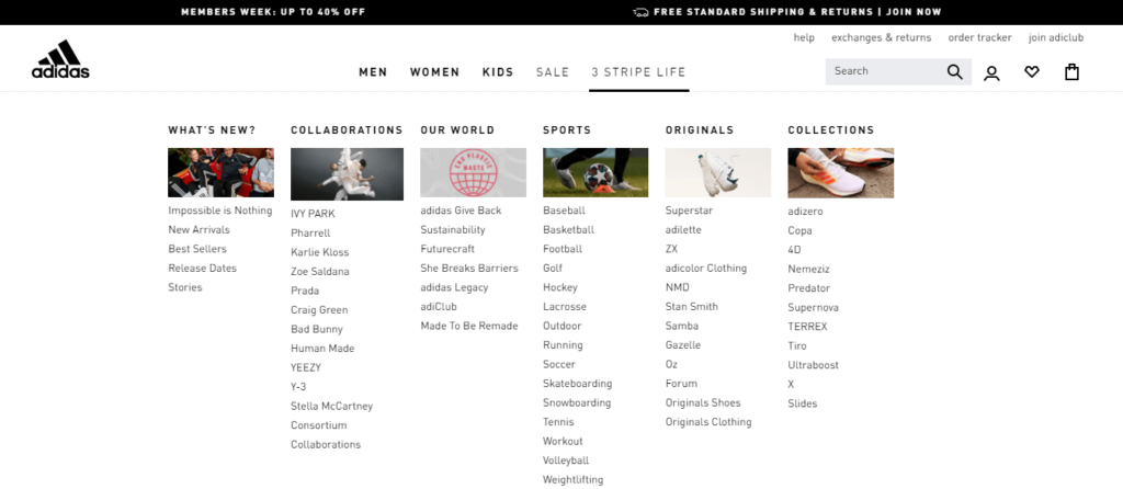
- Leverage mega menus
When dealing with a lot of items in the navigation bar on the website, some prefer drop-down menus. Drop-down menus can be hard to crawl for search engines and hard to discover desirable options for users.
Here is an example of a drop-down menu:

Try using mega menus instead, because they avoid additional scrolling for users and are far more convenient visually:
- Consider user goals
Among other important site navigation best practices you should consider, is to develop your design with user personas in mind. Make research on your potential visitors, find out what their priorities are while visiting your website, and create a unique scenario for each user group to plan navigation accordingly.
- Make the most out of navigation cues
The navigation cues are indicators of where the user is located on the website. In a combination with other elements, they help visitors not to get lost among your pages and minimize the usage of the ‘back’ button.
- Prototyping and testing are a must
Prototyping process will allow you to find out which types of navigation for websites are more suitable for your case than the others and tune up your flows and user experience accordingly. Proper testing will help you to save a lot of time and money, as well as keep your brand image high. Here are some of the most common testing tools:
- Optimal Workshop
- UserTesting
- HotJar
- Make hyperlinks stand out
Design process is fascinating, and it is when you can build great looks for your pages that will help your business to get noticed. However, make sure that your design decisions will not harm navigation. Whatever types of menus on websites you will choose to use, there should be a clear distinction between the color of the text and hyperlinks, so the visitors won’t be confused.
Check official guidelines for more information on this.
- Avoid adding too much to the header
Keep your top-level navigation bar as brief as possible, adding only necessary links that you found out are a must based on your customer research. If adding too many links is unavoidable in your case, leverage sub-menus and categorize links to save space.
- Keep sidebars separate from the main content
Just like with hyperlinks, sidebars should also be visibly separated from the main content block. Always keep it at a certain distance a have a different background color, compared to the color of the body.
- Leverage the space on the footer
The bottom of the page is a place where you can add a few more links, so make the most of this opportunity! A common design decision is just to copy and paste the links from the top part of a page to the bottom, so the visitors won’t have to scroll all the way back. While you can do just that, you can also put some additional links. The common scenario here will be to have ‘About us’ and ‘Contact’ links, and add address information if your business has offices you need to mention.
- Make sure your decisions look great on a mobile screen
If your pages don’t look great on mobile screens, you will be in trouble of losing your clients before they even have the opportunity to experience the great navigation you’ve planned. The least you can do, if you maintain a website yourself, is to control that theme from your CMS is mobile responsive.
The ideal scenario here, of course, is to hire a team of professional software developers that will build everything according to industry standards from the ground up. Finding a proper development partner is a topic for a separate article, however, you can always rely on great reviews on platforms like Clutch or GoodFirms, and ask for information about previous successfully completed projects.
In any case, if you want a mobile-friendly design, consider using such elements as:
- Hamburger menus
- Short text labels
- Buttons and links
- Make the navigation functionality obvious
Pursuing mobile responsiveness can lead you to extensive usage of hamburger menus, which, no doubt, are great for saving space, but have their own drawbacks. The biggest drawback is the fact that the search options will be available only on demand and can be hidden from the users that don’t click on the button. So, consider making your navigation bar visible to your users whenever it is possible.
- Place your elements logically and in the right order
It is also very important to keep your elements consistent and place them in the logical spot to make sure that the visitors will be aware of all existing options. Additionally, make sure that all options are placed in the most logical order according to the needs of your target audience.
- Adding a search bar
While it may be not applicable to all design ideas, adding search functionality can improve user experience and help visitors to find particular categories more easily.
- Double check all links
Unfortunately, your website will not function as intended all the time. There could be multiple reasons why a certain link is not working or direct to a different destination. To make sure that everything functions according to plan, it will be a good idea to check navigation personally from time to time, especially if you had updates, newly added content, or new plugins. Keeping your user experience high is always a priority, so the links need to work!
| Top 15 website navigation design best practices to follow |
| Maintain clear content across all elements |
| Name every label meaningfully |
| Leverage mega menus |
| Consider user goals while designing navigation |
| Make the most out of navigation cues across all pages |
| Always have prototyping and testing phases |
| Make hyperlinks stand out |
| Avoid adding too much to the header |
| Keep sidebars separate from the main content |
| Leverage the space on the footer |
| Make sure your decisions look great on a mobile screen |
| Make the navigation functionality obvious |
| Place your elements logically and in the right order |
| Add a search bar if possible |
| Double check all links |
FAQ
What are the basics of navigation?
The basics of navigation include knowing the user goals, being aware of key design elements and how they work, and a have a vision of how to implement all of this in your particular case. Start with searching great website navigation examples for inspiration and make the best out of your project!
What makes good website navigation?
It is a combination of different elements. First of all, you need to maintain consistency across all pages and have a well-defined hierarchy between navigation elements of all levels, from meta-navigation to the footer. Additionally, strive for mobile responsiveness and make sure to leverage conventional UI elements and patterns.